Kobold is a small company with a big idea: Reimagine and develop medical treatment devices that are superior to the current offering. Many devices used in the treatment of cancers are poorly designed and are cumbersome to use causing doctors and patients frustration.
How does a small medical device company get noticed and stand out in a billion dollar industry overrun with massive manufacturers? You create a brand that rejects the conventional “medical” stereotypes.
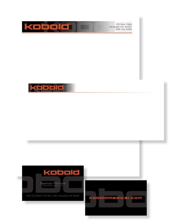
From the corporate colors to the bold look of the logo, website, photography, and business materials; Kobold’s message is, “We’re different and we’re better.”

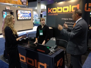
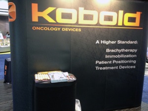
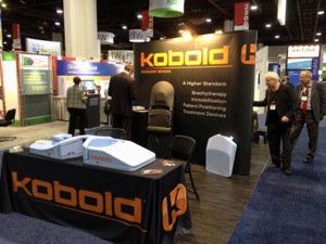
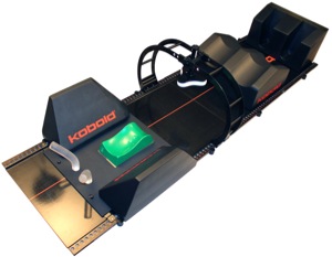
With much of their funding devoted to research and development, Kobold needed to make a big impression on a small budget for their first trade show. We focused on calling attention to the name, prominently displaying the devices (with models demonstrating their function), and limiting information on the display to create curiosity. We worked with the reps in the booth to encourage them to be engaging and informative.
This simple display turned heads and got plenty of attention creating a long list of contacts for sales.
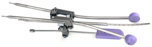
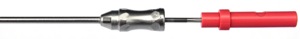
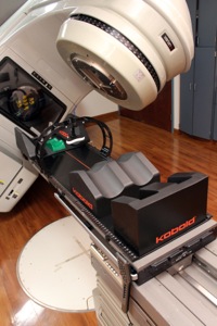
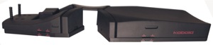
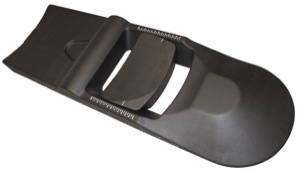
Since the beginning, we have photographed all of
the devices Kobold has produced. This has created a large image library.
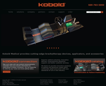
A simple, bold website was designed to showcase Kobold’s ever growing catalog of treatment devices.