
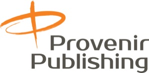
Provenir Publishing needed an identity that could cross over from modern to more a “nostalgic” feel. We created two logos to satisfy their needs. The modern logo is used as the company identity, for their website, and for publications of a more technical nature.
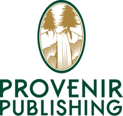
The “nostalgic” logo is used for publications that are targeted at the readers of their “patient handbooks”. This logo is “warm and friendly”, like the books it distinguishes.
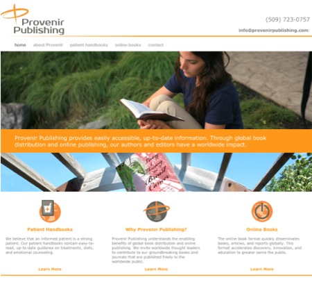
A simple, modern website that is appropriate for the medical and the book publishing industries was designed to be easy to navigate. The website showcases the current publications and books soon to be released.
The website also features picture books written for children with cancer and children whose loved one’s have cancer.


We have designed book covers that are calming and uplifting as well as symbolic of the journey through cancer. The goal is to inspire serenity and understanding in the patient and reassure them that there are many options for treatment and their care team is dedicated to making them cancer free.