The Work
What began as a request for a logo, business cards, letterhead and envelopes, soon came to include a website, product catalog, mailers, packaging design, trade show space design, and an image library. We have become their “go to” source for design and marketing consultation.
Gamma Knife was overdue for updated brochures. The high tech radiation surgery clinic was determined to reach their target market, which is primarily women age 40-70 with a series of brochures highlighting the advanced technical nature of the surgery and equipment while being warm and inviting.
Provenir Publishing is a niche book publisher focused on producing “patient handbooks” for those diagnosed with specific cancers and other diseases and disorders.
Our work with them grew from corporate branding and website design to book cover and layout design and illustration.
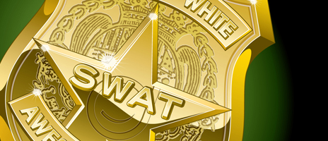
Dr. Jake DaBell, of Dabell Orthodontics, is a brilliant marketer. He approached us with a concept to create a kid’s club for his patients. We designed a “handbook” of information, activities and progress tracking for his S.W.A.T. (Straight. White. Awesome. Teeth) members. NOW braces are cool and fun!
Gelsinger Licensing requested artwork and designs to be licensed for gift bags, greeting cards, craft paper, fabric, and checks. The freedom to fully use our artistic talents is a fun opportunity that keeps us fresh and creative.
You don’t get a second chance to make a first impression. A logo is quite possibly the most important element of a brand. A strong logo can instantly identify a company or organization and distinguish it from others.
What began as a quick job to make a change to an existing brochure grew, within a year, to an association in which we rebranded the entire organization, from marketing to event logistics, we elevated the Barbara Barrington Jones family Foundation to a more professional level of excellence.


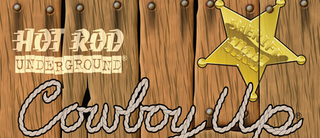
Staging Lane Productions is all things “Hot Rod” and owner, Steve Metz is the real deal... one of the nicest people to grace this planet. In our long relationship, we have created numerous logos, icons, illustrations, and packaging designs. And every once in a while we just sit and chat over a burger and a shake.

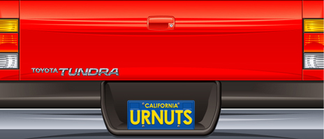
Paramount Farms, a Teleflora company, had a concept for a Super Bowl promotional giveaway. The grand prize was a Toyota Tundra. We designed and illustrated a free standing display of a Toyota Tundra in which the bed of the truck was a display bin for pistachios. The complex design also had to be easy to assemble.

Over the years, we have created hundreds of pieces of art for Hawk apparel and merchandise. At one point, they asked for a new surface effect for their “hawk head” logo. We created this “chromed” effect which became quite popular. In fact it was voted by WIRED magazine as one of the top 10 most recognized logos in the world.

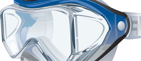
Photography can be quick, easy and on point most of the time. But sometimes it’s even better to have a really nice, detailed illustration on your packaging and user instructions. That’s what Speedo thinks. And we agree... and come through.

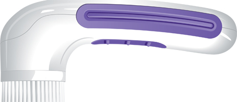
Pretika approached us to create animations to demonstrate the function of their skin exfoliation devices on QVC, HSN, etc. The artwork we created was also used for packaging and online applications.